Amateur Golf Alliance

Amateur Golf Alliance

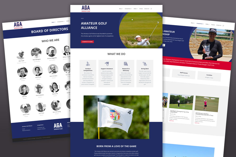
The Amateur Golf Alliance was started to promote and enhance competitive amateur golf. Today professional golf dominates interest in the game but there was a time when amateur golf was just as popular as professional golf. The AGA plans to create more events and take on more initiatives that will benefit the amateur game.

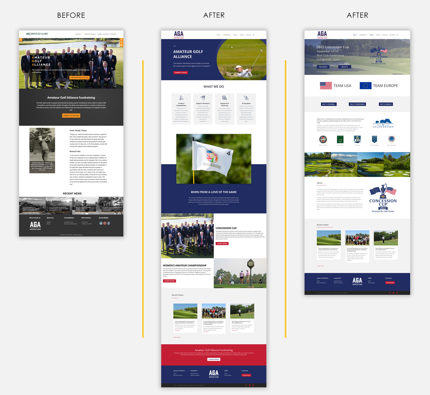
The original Amateur Golf Alliance website was not bad, by any means, however, when Vice President Rob Addington approached me to help spruce it up and make sure that the branding was more consistent, I was very excited to help. One of the original issues was that the website had an orange and black color scheme with a green logo. The actual logo they preferred to use was red and blue. Because of this, the branding was all over the place. The website was also not being updated on any sort of regular schedule.

Our goal was to have the new website ready for the Concession Cup, which is being played this week at the Real Club Valderrama in Sotogrande, Spain. With the lead up to this prestigious international competition, we have a Concession Cup-specific homepage (click here). Once the event’s excitement has passed in a few weeks, we will move back to a homepage which is more focused on the Amateur Golf Alliance as a whole (click here). 

Let’s Create Something

Anera Sports

Anera Sports

Anera Sports LogoIt’s no secret that in 2022, a user-friendly, responsive website is critical for businesses. Your website is often one of the first interactions customers will have with your business and a well-designed website will help with your search engine ranking. Be honest: Is it time for a website redesign?

Many businesses are hesitant to redesign their websites because they think they are too busy to dedicate time and resources to the project and that they don’t need a new site. However, if you’re not seeing enough traffic or engagement, it may be time to consider redesigning your site.

Here are two signs that it might be time to consider an update:

1. You’ve been using the same design for over five years. A lot can change in five years! If you’ve been using the same design since before 2015, then it may be time to update your brand’s look and feel.

2. You have outdated content or products on time  site. If you’re still advertising products that are no longer available or mentioning events that happened long ago, then it may be time to update your content so that it can better represent what you currently offer today.

Getting Started

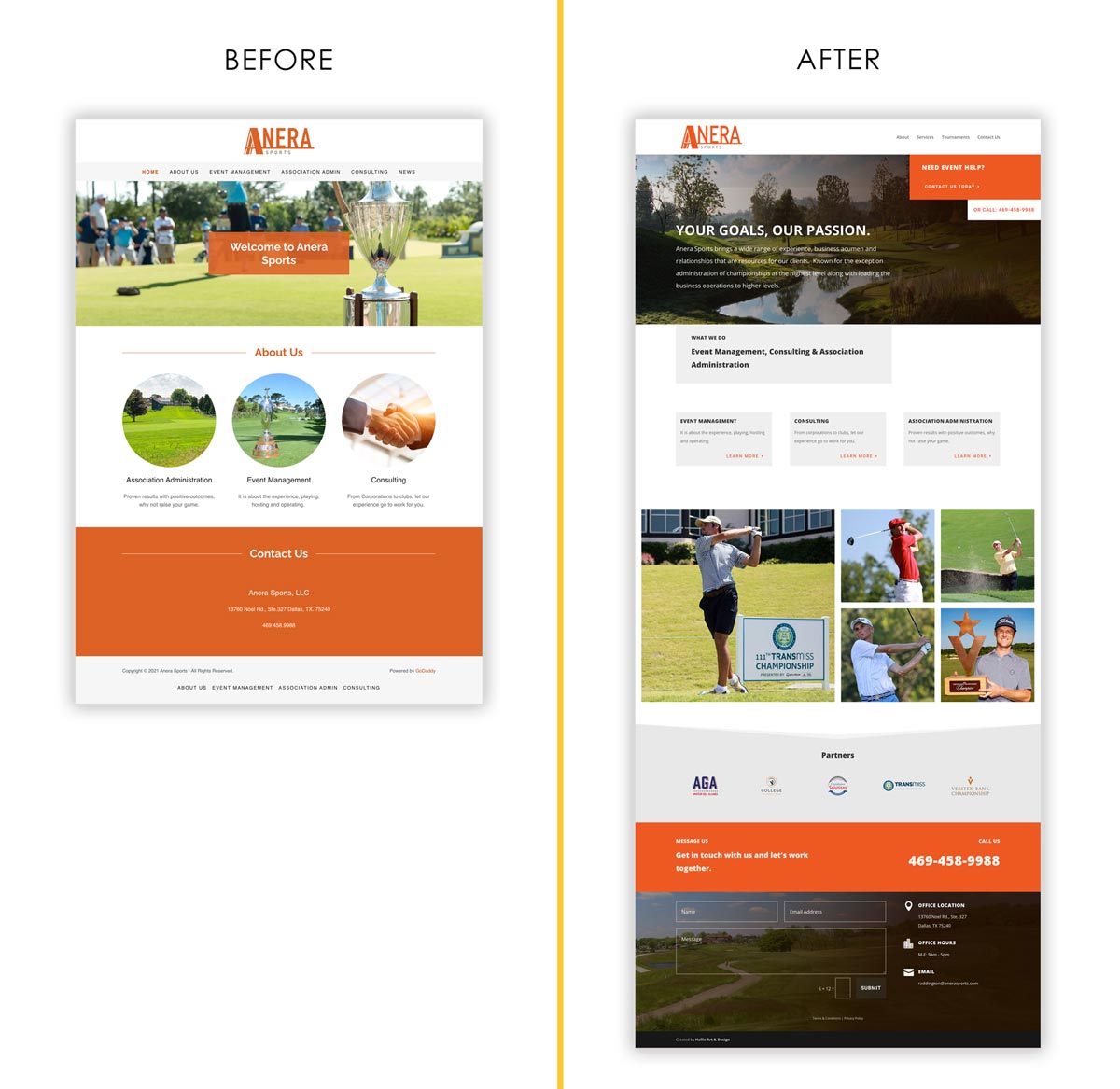
When you landed on Anera Sports old website, you can see quite quickly that it was built with a standard out of the box solution, like Wix or Weebly. This one was actually built using GoDaddy’s website builder. 

The website was not mobile-friendly and it lacked cohesiveness with the brand standards we had built. The company’s staff has decades of experience in tournament administration/management and this is one of its most important differentiators, and that information was lost in the over-simplified design.

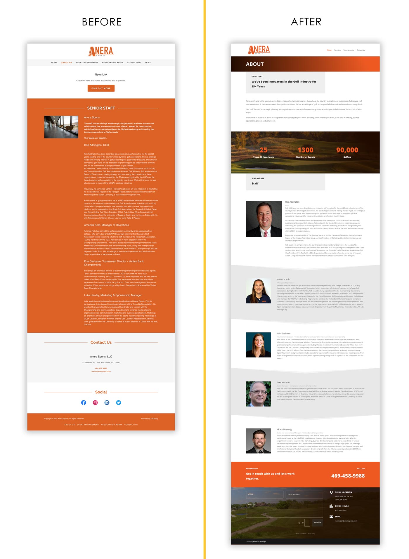
We laid out a site map for the new website that was easier to navigate. We wanted to bring the services and experience to the forefront, and we used simple, organized boxes to distinguish the different service buckets visually. On the About page, we also included photos of the staff and bios highlighting their many years of experience.

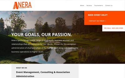
Anera Sports brings a wide range of experience, business acumen and relationships that are resources for our clients.  Known for the exception administration of championships at the highest level along with leading the business operations to higher levels.

“Hallie was wonderful to work with throughout the entire process of redesigning our website. She was knowledgeable, creative, and a great communicator, and we are so pleased with the new look and functionality of our site! We’d absolutely work with Hallie again, and cannot recommend her design services enough!”

Rob Addington
CEO
Anera Sports

Revolver Brewery

Revolver Brewery

Building websites is like putting a puzzle together. Creating and building something that everyone can be proud of is exciting. In this post, I want to share a little bit about the process of redesigning a website.

Background

Revolver Brewery Founded in 2012 in Granbury, Texas by father and son Ron and Rhett Keisler, along with seasoned master brewer and cicerone Grant Wood, Revolver Brewing is one of the fastest growing craft breweries in Texas.

Now owned by MillerCoors, Revolver first approached me in September 2020 to put a bid in to rebuild their website. They were in the middle of a complete company re-brand and wanted a new website to reflect all of their updates.

Getting Started

We officially started in November and all of a sudden, we were off to the races.

First, we shared ideas and collateral. I needed to understand what their visions and goals were. Here you can see some snippets from their Brand Guidelines. This is always helpful, so I stay within their guidelines when I start designing layouts and choosing imagery.

Building a New Website

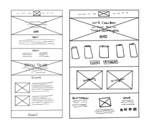
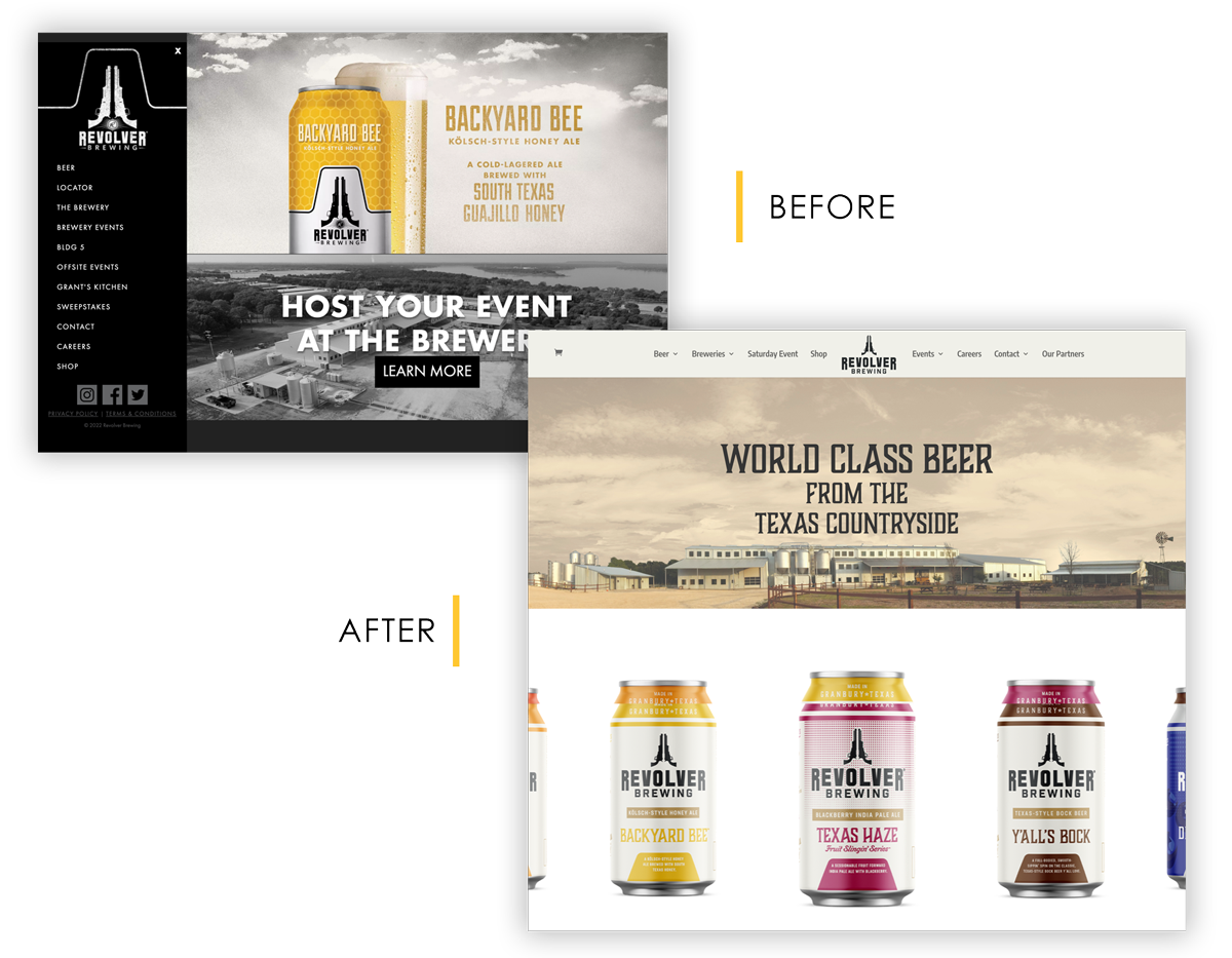
The original site was functional and served its purpose; however, it lacked a lot of content, was not mobile-friendly, and visually felt outdated. After several meetings with their team, I presented these wireframes. Once approved, it was time to build.

To the right is an example of the wireframes created for the home page and a secondary landing page. For each page, I get approval on a wireframe. This communication is crucial during the process so that everyone always remains on the same page.

After approval, I added the actual images and text to each page, sent it to Revolver, and then made adjustments based on their feedback. It’s an easy way to work, and the flow of communication is very successful.

The New and Improved Site

“Hallie was wonderful to work with throughout the entire process of redesigning our website. She was knowledgeable, creative, and a great communicator, and we are so pleased with the new look and functionality of our site! We’d absolutely work with Hallie again, and cannot recommend her design services enough!”

Krista Nussey
Digital Marketing Manager
Revolver Brewery

KWI Website

KWI Website

Building websites are fun. It’s kinda like a puzzle. The client gives you a bunch of random pieces and you have to figure out what’s the best way to reorganize them. In this post, I want to share with you a little bit of the process of redesigning a website, and why it is so important to any growing business.

Background

Kathy WhitworthSeveral years ago I was asked to be on the Kathy Whitworth Invitational committee. I’m  currently on both the Membership and Golf & Greens Committees at Mira Vista Country Club and having the opportunity to be a part of one of the top junior girls tournaments in the country seemed like a no brainer. And selfishly, I really wanted to be around Kathy Whitworth. For those of you that don’t know, Kathy is the most winning professional golfer of all time… male or female. Needless to say, she’s a big deal.

Initial Analysis

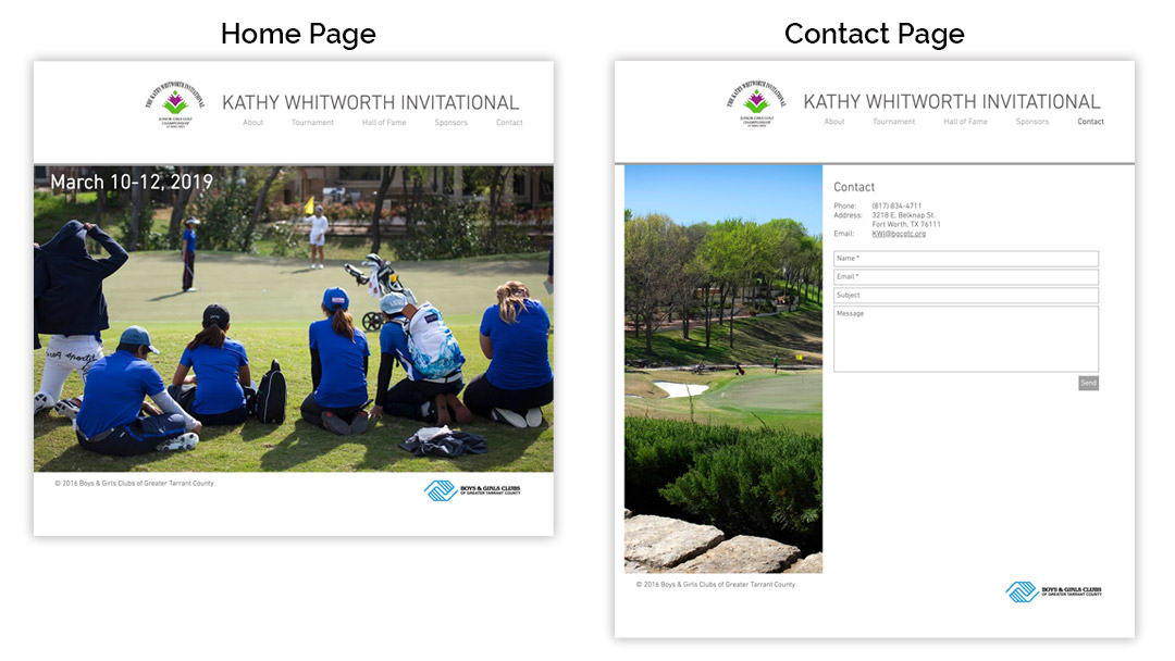
Website ComparisonThe KWI ‘s inaugural year was in 1999, so needless to say, the committee knows what they are doing and has been successful for 20+ years. I was brought to the table to help modernize the overall branding and get a fresh set of eyes on the event.

The website wasn’t mobile-friendly and 51% of the entire global population visits websites from their phone. The logo seemed very busy, especially when it’s scaled down. Again, think about how you’d see it on a mobile device, a business card or even embroidered. I also felt that there was a substantial about of content missing. These are all things in my wheelhouse and I communicated with the whole team why each of these things needed attention.

Planning for a New Website

Now let’s take a look at the website. The original site was created and maintained by the Boys & Girls Club of Greater Tarrant County (the charitable organization that the KWI supports). The website was functional and definitely served its purpose. There were six pages, which included Home, About, Tournament, Hall of Fame and Contact. This was a good foundation but it lacked a lot of content, it wasn’t mobile friendly and visually, was a bit all over the place.

Website Comparison

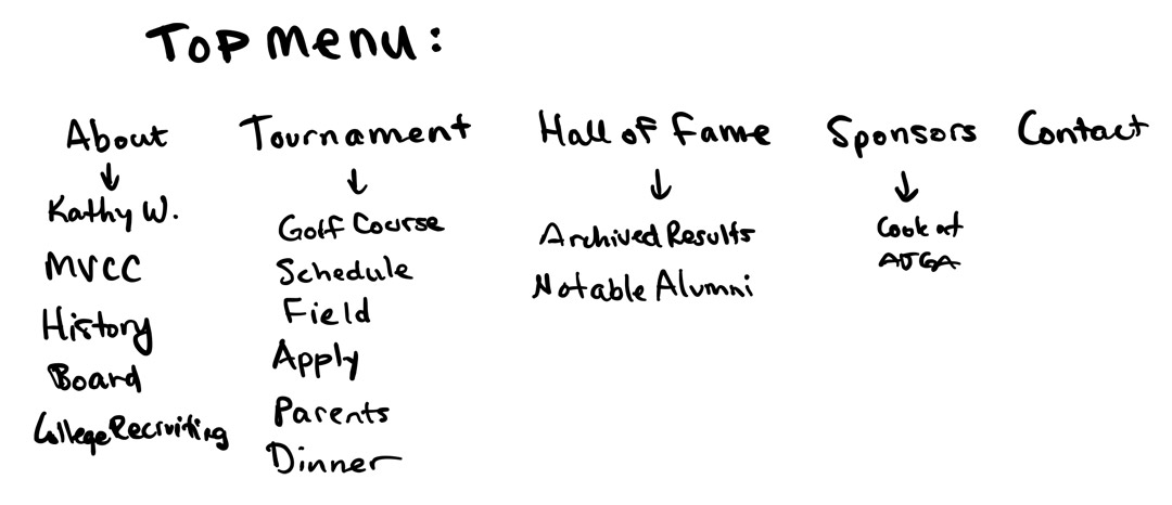
The first step was to decide a general site map – what content do we want to keep and what content do we want to add?

Sketch

From here, there’s the approval process of just making sure that everyone involved is on the same page. The last thing you want to do with a client is think you know what they want, start building and then after hours of work, realize that you guys were not on the same page. So once this general list of pages was approved, I then sketched out the wireframe for the new homepage.

“Hallie joined the Kathy Whitworth Invitational committee two years ago and has been an incredible asset. She has been incredibly generous with her time to completely rebuild the tournament’s website, application and social media channels. With impeccable graphic design, seamless videography and photos, and high functionality, Hallie brought life to the tournament’s digital marketing platforms. Hallie showed incredible care in highlighting the tournament’s rich history,  our tournament’s namesake, Kathy Whitworth, and the tournament’s beneficiary, Boys & Girls Clubs of Greater Tarrant County. Hallie’s talent, creativity and execution are unmatched. The Kathy Whitworth Invitational is more widely known, more efficient and more effective in raising money for Boys & Girls Clubs because Hallie is a part of it.”

Chelsea Tibbitts
Senior Director Advancement Operations
Boys & Girls Club of Greater Tarrant County

Creating a Wireframe
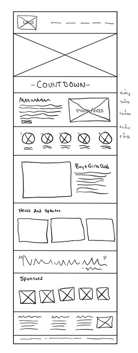
Website Wireframe

We start at the top with the logo and the main navigation menu, followed by the hero image. I wanted to make sure from the homepage, it was very easy to find out more information about the event, about Kathy Whitworth’s history and career, highlight the fact that the alumni pool is filled with LPGA players and that the tournament benefits the Boys & Girls Club of Greater Tarrant County.

I recommend that once you’ve created the wireframe, that you don’t just send it to your client and wait for their feedback. It’s really important to walk them through your design and give them the “WHY”. Why did you do this on the layout… why did you put that there… Often times people aren’t sure of what they like or don’t like, so it’s helpful if you can walk through and talk with them about your vision. You have to remember that not everyone can instantly visualize a final product if they only see a wireframe.

Building the New Website

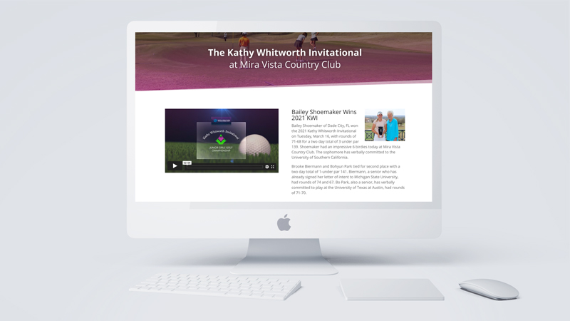
This is now the fun part, taking the approved designs and actually building it out. Things might shift and change a little, but the general layouts stay the same when you go from a wireframe to the new pages. It’s important to always remind the client that a website is a living, breathing thing – it’s always going to be changing and will constantly be updated.

What makes this website so much fun is the content. There are quite a few LPGA players who have either played in or won the Kathy Whitworth Invitational. Through the new Instagram account, I messaged all of the former champions who are currently on the LPGA and asked if they would like to send us a quote for the website. We heard back from quite a few, which was really exciting, so those quotes are now scattered through out the different pages.

I also recommend as you are uploading photos and building pages, that you add key words and alt tags as you go. It’s a pain but it’s much better than having to back track and add those things after you’ve built all the pages. It’s also extremely important to make sure that you site looks good and functions at it’s best on desktop, tablet and mobile.

Over the past two years, we’ve continually added content about Kathy Whitworth, so when you google her, this website comes up. We’ve also added more about Mira Vista Country Club so that helps as well with searches. Links in and out of the website help with SEO as well, so on the Hall of Fame and Alumni page, we linked everyone’s photo to either their LPGA profile page or their World Amateur Golf Ranking page.

This is a website that a lot of energy has been put into it, and I’m so proud, not only of how this site turned out, but how successful the Kathy Whitworth Invitational has been for junior golf and for raising money for the Boys & Girls Club of Greater Tarrant County.
<