Demo Program

Demo Program

Ben Hogan Golf is fully direct-to-consumer, so the only way for customers to try the clubs before they buy them is to go through the Demo Program. This 18 second video will be used in digital advertising showcasing the program. A shorter, 15 second version will be in the rotation of Ben Hogan Golf spots on The Golf Channel.

Genesis ES Headshots

Genesis ES Headshots

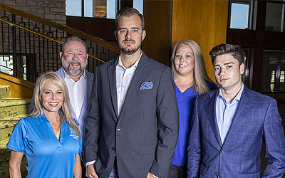
The team at Genesis Elevator Company needed some new headshots that will go on the website we are currently building. We went with a corporate feel and shot these in the entry way at Mira Vista Country Club.

Ben Hogan Sunday Bag

Ben Hogan Sunday Bag

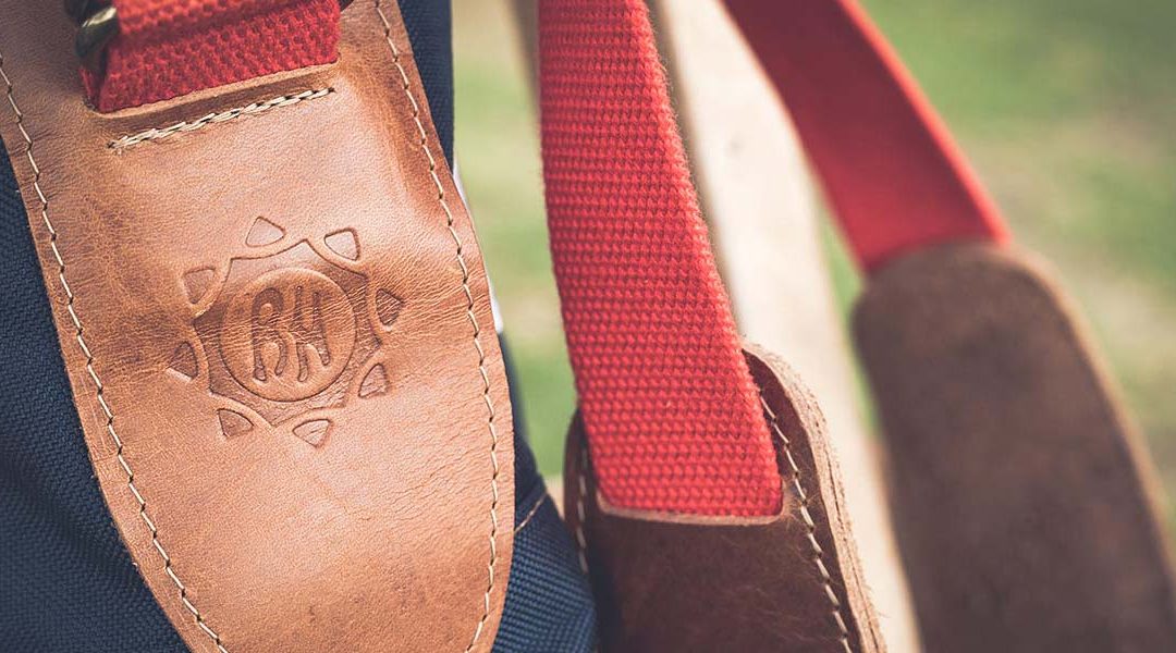
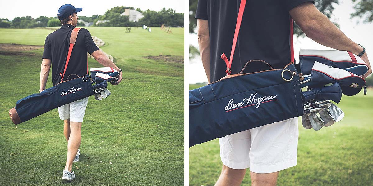
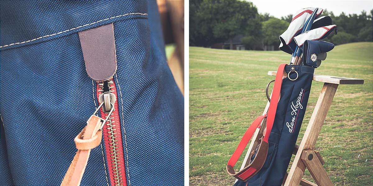
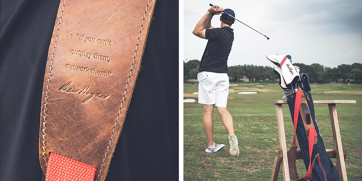
During US Open week, Ben Hogan Golf partnered with the Steurer & Co. studio out of Louisville, KY. The seven-inch unstructured Sunday Bag features 1000D Cordura canvas, white and red stitching, hand-stitched and heat stamped steer hide trim, solid antique brass hardware and zipper, and reinforced with solid copper hand hammered rivets. The following images were lifestyle images used for the social media campaign, which successfully collected over 2,000 new email addresses.

Edge EX Irons

Edge EX Irons

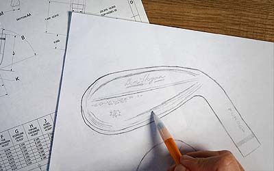
The Ben Hogan Golf Equipment Company introduced the much-anticipated Edge EX irons, designed for mid-handicap players who are serious about improving their games and playing to their maximum potential. The new irons represent the latest in a long line of industry-changing Edge irons which were originally introduced by the Company in the late 1980’s to the delight of golfers who appreciated their unique combination of forgiveness with the feel only a forged iron can provide.

The new Edge EX irons were designed from the ground up to be extremely easy-to-hit. The Company anticipates that Edge EX irons will attract a new segment of the market to the Ben Hogan brand. Research conducted by the Ben Hogan Golf Equipment Company indicated that many ‘non-competitive’ golfers were intimidated by Hogan’s long-standing reputation for manufacturing golf equipment for the most discerning and accomplished players in the world.

“Ben Hogan golf equipment has long been used by some of the best players in the world” said Scott White, President and CEO of Ben Hogan Golf Equipment Company. “Some golfers who play the game just for fun or few a few bucks in friendly games felt that our products weren’t for them. We continue to try to educate golfers that forged clubs are not reserved for only the best players in the world. In fact, quite the contrary. Edge EX irons will offer average golfers the playability, forgiveness and feel that Ben Hogan once described as ‘… that blissful feeling that goes from your hands, up your arms, and into your heart.’”


KWI Website

KWI Website

Building websites are fun. It’s kinda like a puzzle. The client gives you a bunch of random pieces and you have to figure out what’s the best way to reorganize them. In this post, I want to share with you a little bit of the process of redesigning a website, and why it is so important to any growing business.

Background

Kathy WhitworthSeveral years ago I was asked to be on the Kathy Whitworth Invitational committee. I’m  currently on both the Membership and Golf & Greens Committees at Mira Vista Country Club and having the opportunity to be a part of one of the top junior girls tournaments in the country seemed like a no brainer. And selfishly, I really wanted to be around Kathy Whitworth. For those of you that don’t know, Kathy is the most winning professional golfer of all time… male or female. Needless to say, she’s a big deal.

Initial Analysis

Website ComparisonThe KWI ‘s inaugural year was in 1999, so needless to say, the committee knows what they are doing and has been successful for 20+ years. I was brought to the table to help modernize the overall branding and get a fresh set of eyes on the event.

The website wasn’t mobile-friendly and 51% of the entire global population visits websites from their phone. The logo seemed very busy, especially when it’s scaled down. Again, think about how you’d see it on a mobile device, a business card or even embroidered. I also felt that there was a substantial about of content missing. These are all things in my wheelhouse and I communicated with the whole team why each of these things needed attention.

Planning for a New Website

Now let’s take a look at the website. The original site was created and maintained by the Boys & Girls Club of Greater Tarrant County (the charitable organization that the KWI supports). The website was functional and definitely served its purpose. There were six pages, which included Home, About, Tournament, Hall of Fame and Contact. This was a good foundation but it lacked a lot of content, it wasn’t mobile friendly and visually, was a bit all over the place.

Website Comparison

The first step was to decide a general site map – what content do we want to keep and what content do we want to add?

Sketch

From here, there’s the approval process of just making sure that everyone involved is on the same page. The last thing you want to do with a client is think you know what they want, start building and then after hours of work, realize that you guys were not on the same page. So once this general list of pages was approved, I then sketched out the wireframe for the new homepage.

“Hallie joined the Kathy Whitworth Invitational committee two years ago and has been an incredible asset. She has been incredibly generous with her time to completely rebuild the tournament’s website, application and social media channels. With impeccable graphic design, seamless videography and photos, and high functionality, Hallie brought life to the tournament’s digital marketing platforms. Hallie showed incredible care in highlighting the tournament’s rich history,  our tournament’s namesake, Kathy Whitworth, and the tournament’s beneficiary, Boys & Girls Clubs of Greater Tarrant County. Hallie’s talent, creativity and execution are unmatched. The Kathy Whitworth Invitational is more widely known, more efficient and more effective in raising money for Boys & Girls Clubs because Hallie is a part of it.”

Chelsea Tibbitts
Senior Director Advancement Operations
Boys & Girls Club of Greater Tarrant County

Creating a Wireframe

Website Wireframe

We start at the top with the logo and the main navigation menu, followed by the hero image. I wanted to make sure from the homepage, it was very easy to find out more information about the event, about Kathy Whitworth’s history and career, highlight the fact that the alumni pool is filled with LPGA players and that the tournament benefits the Boys & Girls Club of Greater Tarrant County.

I recommend that once you’ve created the wireframe, that you don’t just send it to your client and wait for their feedback. It’s really important to walk them through your design and give them the “WHY”. Why did you do this on the layout… why did you put that there… Often times people aren’t sure of what they like or don’t like, so it’s helpful if you can walk through and talk with them about your vision. You have to remember that not everyone can instantly visualize a final product if they only see a wireframe.

Building the New Website

This is now the fun part, taking the approved designs and actually building it out. Things might shift and change a little, but the general layouts stay the same when you go from a wireframe to the new pages. It’s important to always remind the client that a website is a living, breathing thing – it’s always going to be changing and will constantly be updated.

What makes this website so much fun is the content. There are quite a few LPGA players who have either played in or won the Kathy Whitworth Invitational. Through the new Instagram account, I messaged all of the former champions who are currently on the LPGA and asked if they would like to send us a quote for the website. We heard back from quite a few, which was really exciting, so those quotes are now scattered through out the different pages.

I also recommend as you are uploading photos and building pages, that you add key words and alt tags as you go. It’s a pain but it’s much better than having to back track and add those things after you’ve built all the pages. It’s also extremely important to make sure that you site looks good and functions at it’s best on desktop, tablet and mobile.

Over the past two years, we’ve continually added content about Kathy Whitworth, so when you google her, this website comes up. We’ve also added more about Mira Vista Country Club so that helps as well with searches. Links in and out of the website help with SEO as well, so on the Hall of Fame and Alumni page, we linked everyone’s photo to either their LPGA profile page or their World Amateur Golf Ranking page.

This is a website that a lot of energy has been put into it, and I’m so proud, not only of how this site turned out, but how successful the Kathy Whitworth Invitational has been for junior golf and for raising money for the Boys & Girls Club of Greater Tarrant County.

<